
.png)
Role
UX/UI Designer
Project Type
End to End Application
Timeframe
9 Weeks
Tools
Figma
OVERVIEW
Aurora is a mindfulness and mood-tracking app designed for busy individuals seeking simple ways to manage stress and improve mental clarity. The app provides users with a safe space to process emotions, track their moods, and engage in calming exercises without directly addressing mental health to reduce stigma.
THE PROBLEM
Finding a quick and safe way to process emotions and relieve stress can be challenging. Research indicates that approximately 41% of adults worldwide experience significant stress, with emotional stress on the rise in many countries. However, many existing solutions can feel overwhelming or time-consuming.
How might we help users express their emotions in a quick and easy way?
RESEARCH GOAL
Aurora is a mindfulness and mood-tracking app designed for busy individuals seeking simple ways to manage stress and improve mental clarity. The app provides users with a safe space to process emotions, track their moods, and engage in calming exercises without directly addressing mental health to reduce stigma.
COMPETITIVE ANALYSIS
To understand the current landscape of mood-tracking and mindfulness apps, an analysis was conducted on three popular competitors: Daylio, Moodnotes, and Moody.
KEY INSIGHTS
-
Existing apps provide mood tracking, journaling, and insights but lack a combination of personalization and gamification.
-
There is a lack of customization options for mood tracking and affirmations
OPPORTUNITIES
-
Enhanced Personalization
-
Customized Affirmations based on user’s moods
-
Seamless UI & Visual Appeal
-
Gamefication
While these tools help users understand their feelings and identify negative patterns, they often lack features that actively promote positive emotions. Additionally, some users find these apps complex or time-consuming to use. Our goals is to simplify this experience by offering a quick, easy-to-use tool that encourages positive emotional habits.
CONDUCTING USER INTERVIEWS
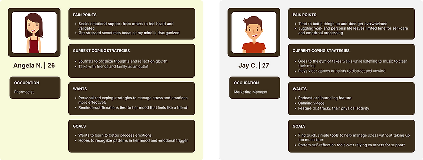
For user interviews, I spoke with five individuals aged 23-29, each experiencing different levels and causes of stress. The goal was to understand how they manage these feelings and whether they use any existing tools or apps for support.
Using insights gathered from the user interviews, I was able to build two personas Angela and Jay.
.png)
WHAT DID WE LEARN
From our user interviews, I identified key insights about how people manage stress and process emotions:
1. Simplicity
Users want quick, easy tools that don’t feel like extra work.
2. Different Coping Styles
Some prefer independent activities like exercise or gaming, while others rely on journaling or talking to friends for support highlighting the need for personalized tools that adapt to individual preferences
3. Personalization
Tailored reminders and coping strategies can make stress management more effective because they align with individual needs and preferences.
4. Managing Emotions
Users struggle to process their feelings and need simple tools to help them without adding additional stress.
CRAFTING THE SOLUTION
To address these concerns, the goal is to create a simple, quick, and stress-free tool that helps people process their emotions without feeling overwhelmed.
To bring this vision to life, I brainstormed some features to incorporate.:
-
A short onboarding quiz to tailor the experience from the start
-
Quick mood tracking for easy daily check-ins
-
Personalized reminders and affirmations based on user goals or emotional state
-
Visual mood insights to help users recognize patterns over time
-
Breathing exercises and calming videos to encourage mindfulness on the go
USER FLOWS
To ensure a smooth and intuitive experience, I designed three key user flows that reflect the core functions of the app
Onboarding Quiz
Guides users through a quick, personalized setup process to tailor the app to their preferences.
Logging Mood
Allows users to easily check in with how they’re feeling by selecting one or more emotions.
Viewing Daily Affirmation
Provides users with a moment of encouragement and positivity through personalized affirmations based on their mood or preferences.

DEVELOPING LOW-FIDELITY WIREFRAMES
Once the user flows were finalized, I created low-mid fidelity wireframes to bring the structure of the app to life.
These wireframes helped me plan the layout, structure, and main interactions without worrying much about the visuals yet.
I focused on making the app easy to use so people could navigate smoothly and complete key tasks without confusion. This stage was important for gathering early feedback and refining the experience before moving on to high-fidelity designs.

EARLY TESTING
I conducted early testing on the wireframes with the five participants I interviewed. Overall, the testing went well—users understood the screen flow and provided valuable feedback for improvement!
BRANDING
For branding, I chose a pastel color palette with a focus on soft blues to create a calming and soothing experience for users. The goal was to make the app feel light, welcoming, and stress-free.
%201.png)
HIGH-FIDELITY WIREFRAMES
After refining the structure through low-mid fidelity wireframes and incorporating feedback from user testing, I moved on to high-fidelity wireframes. This stage focused on visual design, incorporating branding elements like the pastel color palette and soft UI components to reflect the calm ambience of the app.

USER TESTING
I conducted usability testing on the high-fidelity prototype with the same five users I interviewed earlier. They walked through three core flows: completing the onboarding quiz, logging a mood, and viewing the affirmation of the day.
KEY TAKEAWAYS
-
All participants successfully completed each task
-
They found the mood logging interaction intuitive, especially how easy it was to select and deselect moods
-
The color palette was well-received. Uers described it as calming and visually pleasing
-
The short onboarding quiz was appreciated for being quick and easy to complete
Overall, the testing was successful! One user recommended adding a white background to the mood logging screen to match the home screen for better visual consistency. I also spotted a few areas where I could refine some components:

Placed the field input outside of the box for better accessibility
Updated button colors to prevent user perception
Added a white background for better visibility of the selections
Added “Select all that applies” option for users
Similar to the home page, I updated button colors to prevent user perception
Added a white background for better visibility
REFLECTION
Working on this project taught me how meaningful even small, thoughtful design choices can be especially when it comes to helping people manage their emotions. I really enjoyed turning an idea into something that feels both useful and comforting. If I could go back, I’d spend more time testing different design styles earlier on and exploring more diverse user feedback. This was a great learning experience, and I look forward to growing even more in my next projects.